Founder & Lightning Design System
design system
accesibility
dev documentation

Built a scalable design system from scratch that cut project delivery time from 6 months to 3 months, improved accessibility compliance by 26%, and became the foundation for all product work across the company.
Year
2024
Services
Design Systems, Component Library, Design Tokens, Accessibility, Developer Documentation
Context
Every time we started a new project, we had to:
Rebuild the same components over again.
Buttons, forms, navigation, modals — designed from scratch every time. Each version looked slightly different because there was no single source of truth.
Collect all previous use cases and create new ones.
We'd dig through old files to see how we solved a similar problem last time, then adapt it. This took days per project.
Hand off inconsistent designs to developers.
Without standardized components, developers had to interpret every design individually. This slowed down dev, created bugs, and made updates a nightmare.
The result:
Average project delivery: 6 months
Design and dev constantly out of sync
No scalability — every new feature felt like starting over
The insight: We weren't building a product. We were rebuilding the same foundation over and over.
The Problem
Every time we started a new project, we had to:
Rebuild the same components over again.
Buttons, forms, navigation, modals — designed from scratch every time. Each version looked slightly different because there was no single source of truth.
Collect all previous use cases and create new ones.
We'd dig through old files to see how we solved a similar problem last time, then adapt it. This took days per project.
Hand off inconsistent designs to developers.
Without standardized components, developers had to interpret every design individually. This slowed down dev, created bugs, and made updates a nightmare.
The result:
Average project delivery: 6 months
Design and dev constantly out of sync
No scalability — every new feature felt like starting over
The insight: We weren't building a product. We were rebuilding the same foundation over and over.
What We Built
I built a scalable design system from the ground up — a unified component library with Figma tokens and variables that served as the foundation for all future projects.
This wasn't just organizing files. It was designing infrastructure.
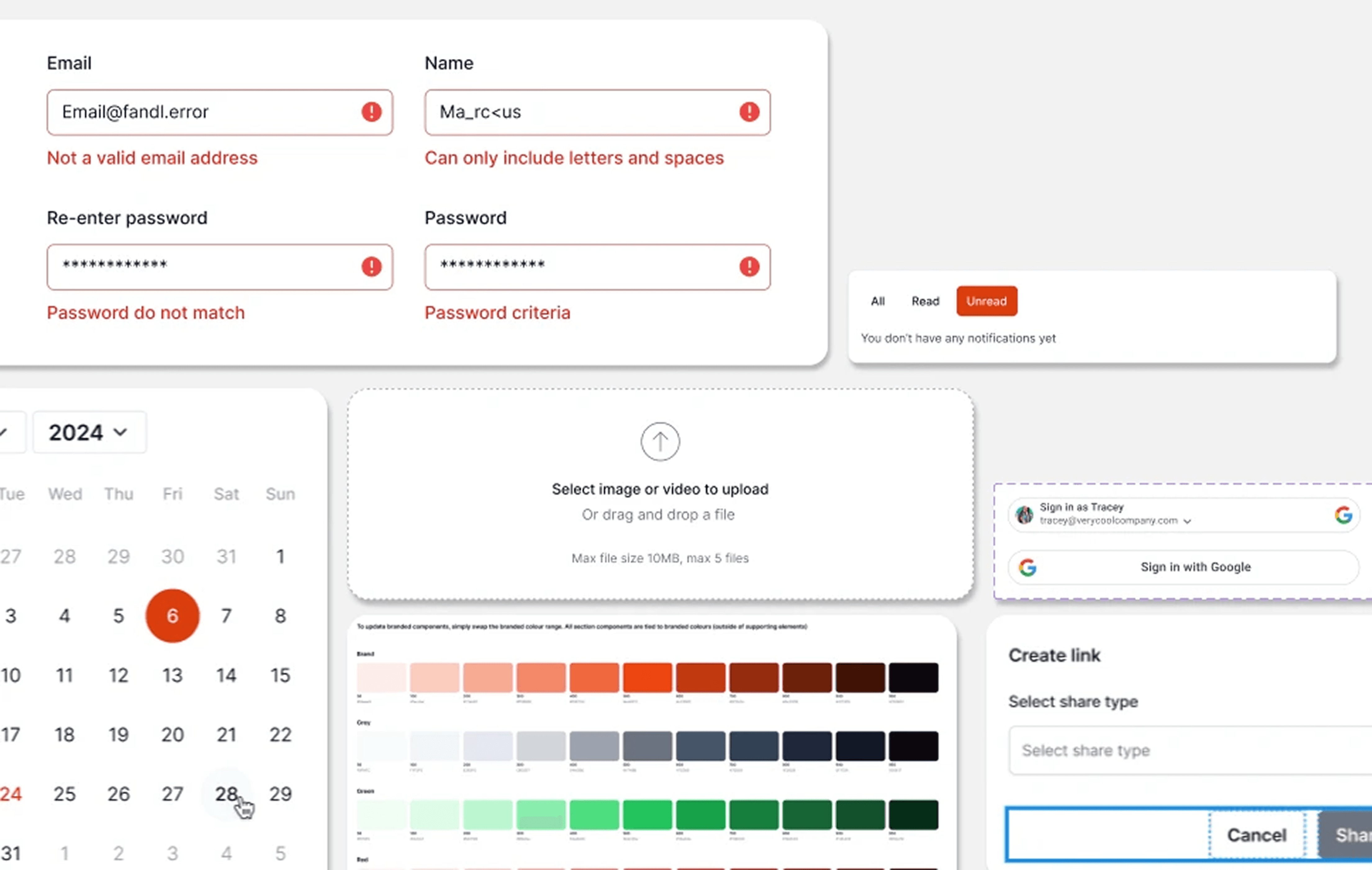
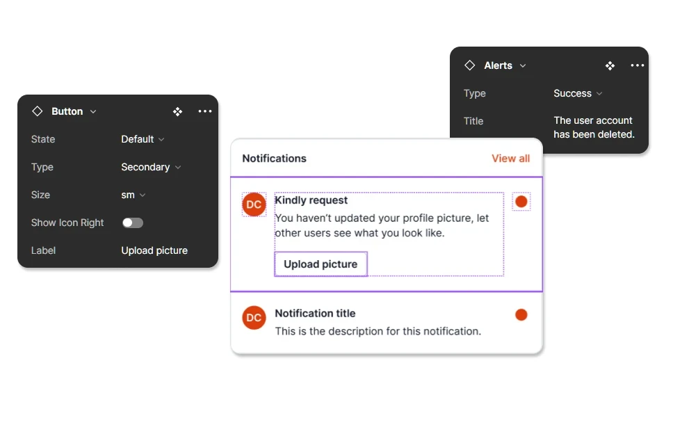
1. Component Library with Design Tokens
I created reusable components for every UI element we used repeatedly: buttons, inputs, cards, navigation, modals, dropdowns, tables.
Each component had:
State changes (default, hover, active, disabled, error)
Design specs (spacing, typography, color, sizing)
Variables and tokens (so color and spacing updates propagated across the entire system automatically)
Developers could now pull exact values from the design system instead of guessing measurements or hardcoding colors.
2. Documentation for Designers and Developers
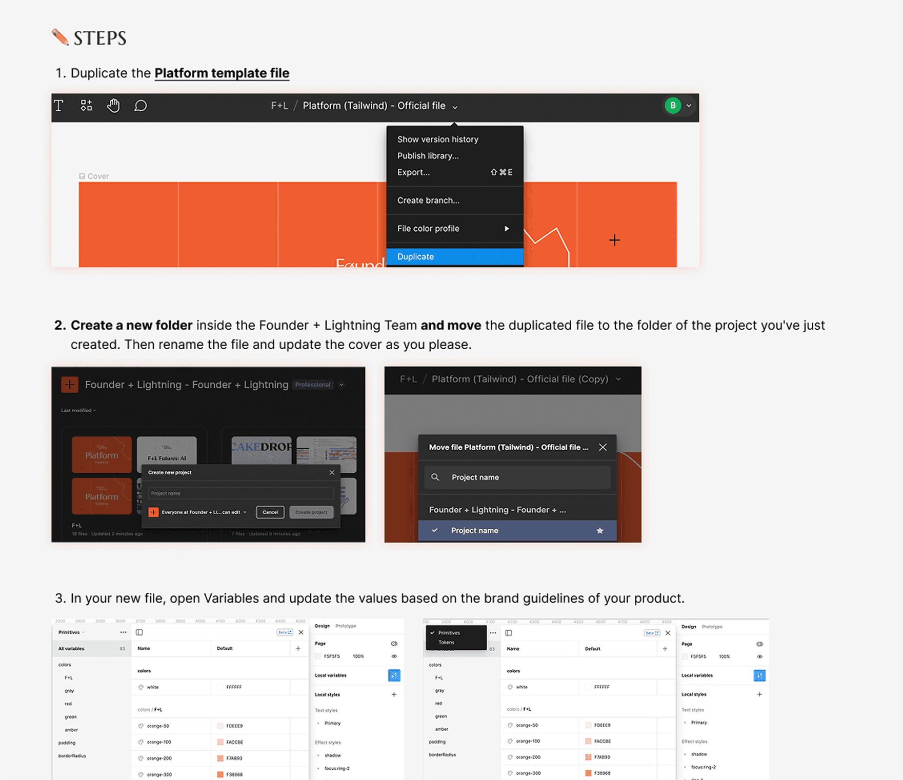
I wrote a full "How to Use This File" guide that covered:
About Figma Variables: How the token system works and why it matters
How to use components without breaking tokens/variables: Step-by-step instructions so designers could work with the system without destroying its integrity
Design system foundation: Typography, color schemes, spacing rules, grid system
Variables structure: How tokens are organized (color, typography, spacing) and how to apply them
FAQs: Common issues, troubleshooting, customization guidelines
This made the system self-serve. New designers and developers could onboard themselves without needing me to explain it every time.
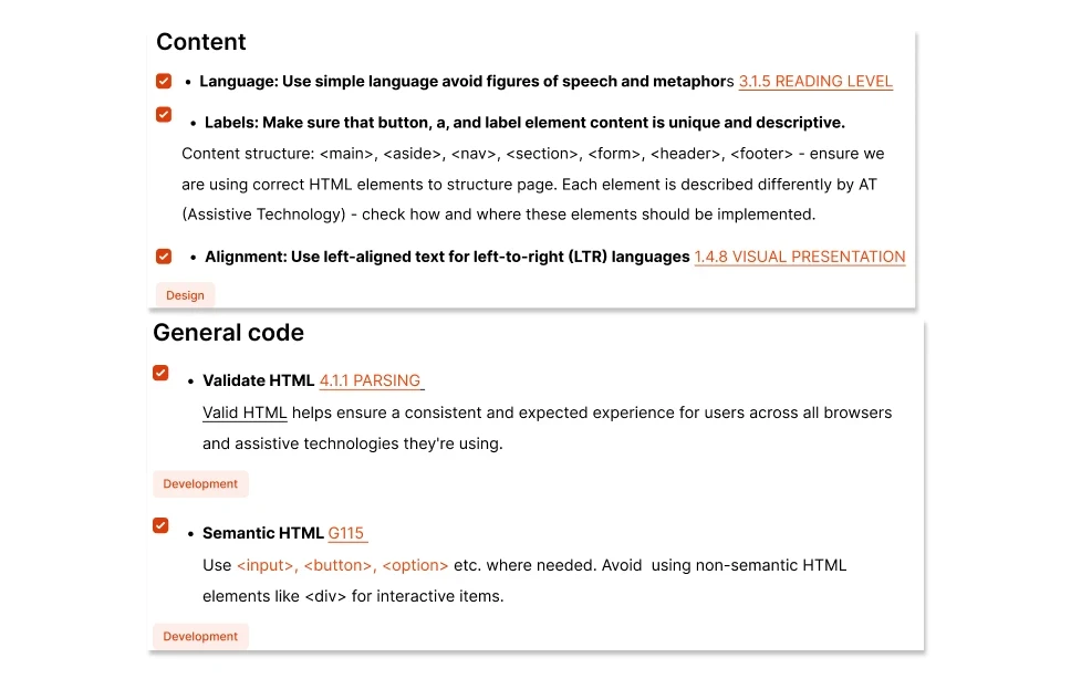
3. Accessibility Checklist
We built an accessibility checklist aligned with WCAG standards to ensure every component met accessibility requirements.
After development, the dev team validated the platform using this checklist. Buttons, forms, navigation — everything was tested for screen reader compatibility, keyboard navigation, color contrast, and focus states.
Impact: Accessibility compliance improved by 26%, which directly improved engagement among our older target users who needed clearer navigation and better readability.
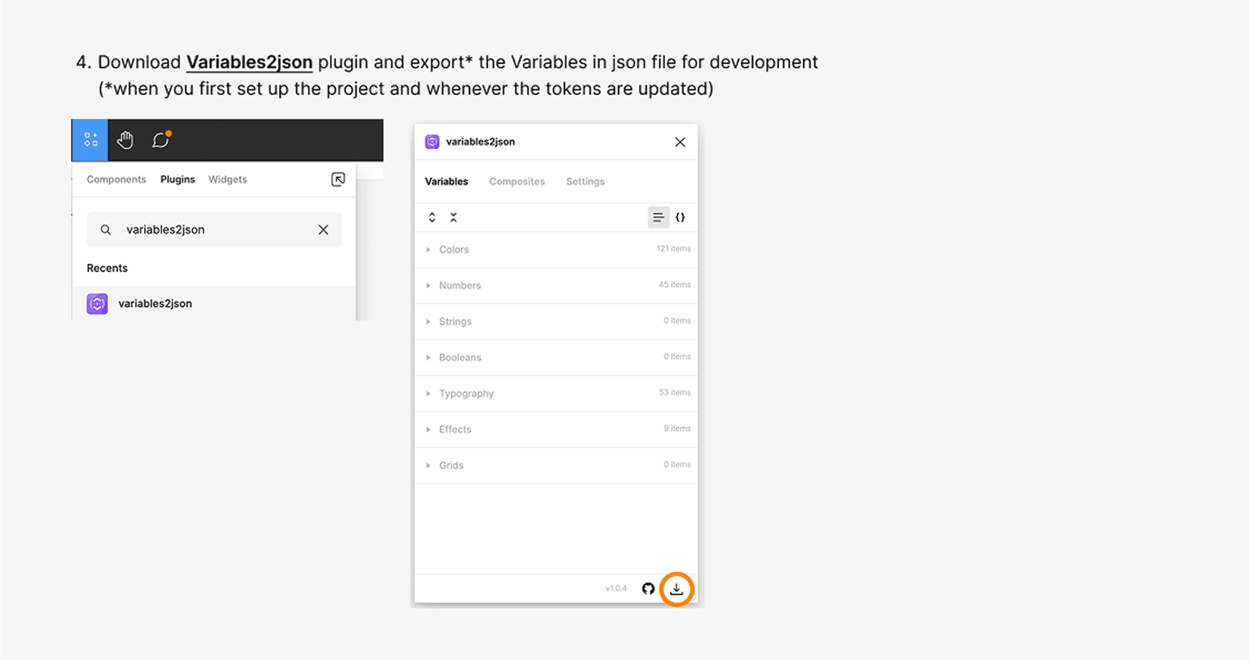
4. JSON Export for Developer Handoff
To speed up design-to-dev handoff, I streamlined the process of exporting updated tokens as a JSON file.
Developers could import the latest design updates directly into the codebase without manually recreating styles. This eliminated translation errors and kept design and dev in sync.
Outcome
Project delivery time cut in half.
Average delivery went from 6 months to 3 months. We stopped rebuilding the same components and started iterating on features.
Design-to-dev handoff faster and more accurate.
Developers had exact specs, tokens, and component documentation. No more guessing. No more "this doesn't match the design" bugs.
Consistency across the entire platform.
Every button, form, and modal looked and behaved the same. The product finally felt cohesive.
Scalability unlocked.
New features were built by assembling existing components, not designing from scratch. The system became the foundation for everything we shipped.
Accessibility improved by 26%.
Older users — a core target demographic — could navigate the platform independently. This contributed to measurable engagement growth in that segment.
What I Learned
Systems thinking is senior-level work.
Building a design system wasn't glamorous, but it was strategic. It unblocked the entire team and let us scale without burning out.
Documentation is design.
A design system without documentation is just a Figma file. The "How to Use This" guide made the system actually usable. New designers and developers could adopt it without hand-holding.
Tokens and variables are non-negotiable.
Hardcoding values is how you end up with 47 shades of gray and buttons that look different on every screen. Variables gave us one source of truth that updated everywhere automatically.
Accessibility isn't extra work — it's a design decision.
Building the accessibility checklist forced us to think about inclusive design upfront, not as a post-launch afterthought. The 26% compliance lift wasn't just a metric — it meant real users could actually use the product.

