HelpGrid Checkout Redesign
Art
UI/UX
Web

Redesigned the checkout experience end-to-end — reduced friction, added trust signals, optimized copy. Result: +9.3% revenue lift, $83K incremental revenue, 28.7% increase in close rate across 83,007 invoices.

Context
HelpGrid is the customer service and sales operation layer for a portfolio of health and wellness brands. When customers abandon their cart or decline a sale on the phone, agents send them invoices via email to complete the purchase later. The problem: the checkout experience attached to those invoices wasn't converting. Customers were clicking through, but dropping off before completing payment.
The Problem
The old checkout page had friction everywhere. We didn't need user research to tell us — the numbers already screamed it:
Close rate: 1.08%
Revenue per invoice sent: $3.42
Every invoice we sent was leaving money on the table.
Here's what was broken:
Too many steps.
The checkout flow had unnecessary fields, decision points, and pages. Every extra click gave customers a reason to bail.
No trust signals.
Customers didn't know who they were buying from. No branding, no security badges, no reassurance. Just a generic payment form.
Confusing layout.
The page hierarchy was flat. Customers didn't know what to focus on — product details, payment fields, and CTAs all competed for attention.
The insight: Conversions don't fail because customers aren't interested. They fail because the experience makes them second-guess.
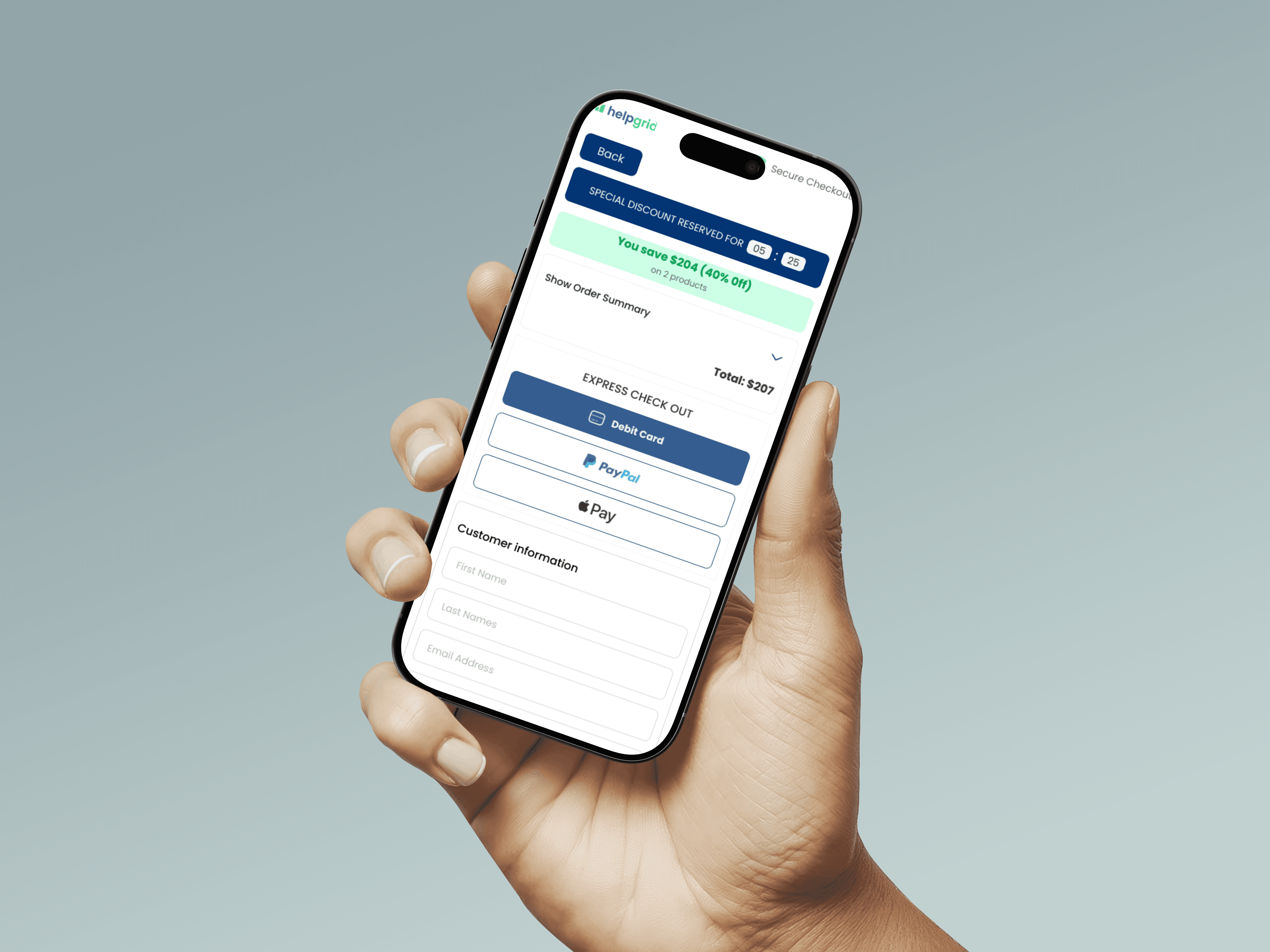
What we built
I redesigned the entire checkout experience end-to-end. The goal: reduce friction, build trust, guide the user toward one action — complete the purchase.
1. Simplified the Flow
Before: 6+ input fields, multiple decision points, generic layout.
After: Streamlined to 4 essential fields. One clear path to checkout.
I removed everything that wasn't critical to completing the transaction. Fewer fields = fewer reasons to quit.
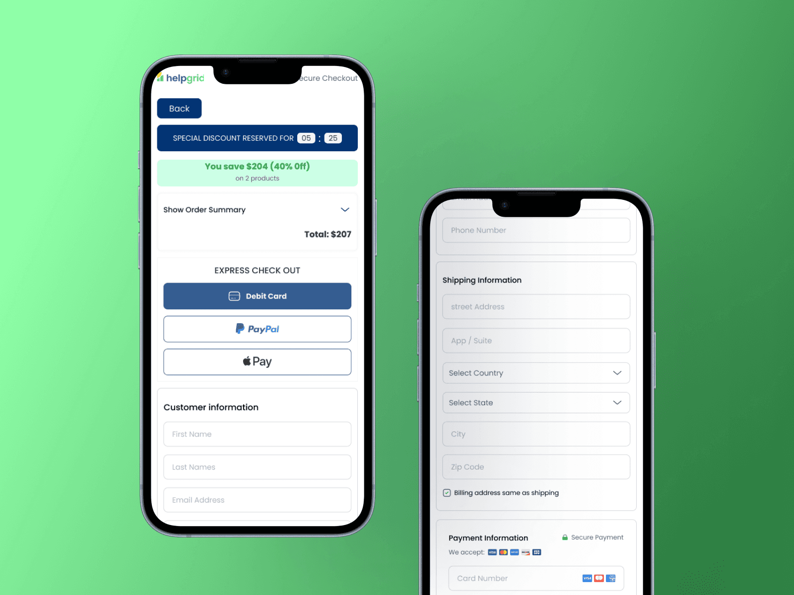
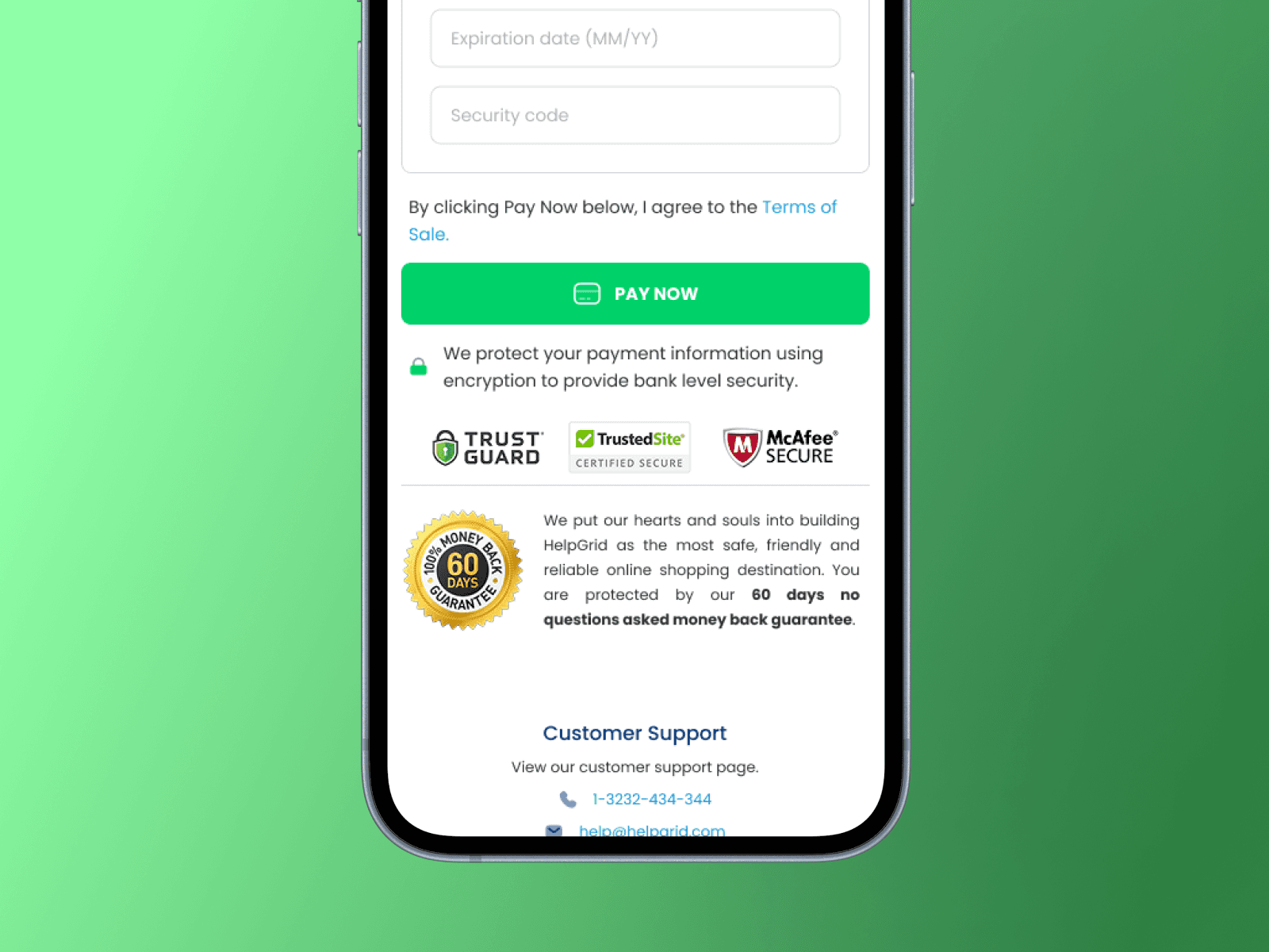
2. Added Trust Signals
Customers need to feel safe before they enter payment info. We introduced:
Brand logos at the top of every invoice (Citrus Burn, HealthyFlow, Alphacur — whatever product they ordered)
Security badges near the payment CTA
Risk-free messaging ("No commitment. Cancel anytime. Full refund if not satisfied.")
This wasn't just visual polish. It was conversion psychology. Customers who trust the page complete the purchase.
3.Rebuilt the Visual Hierarchy
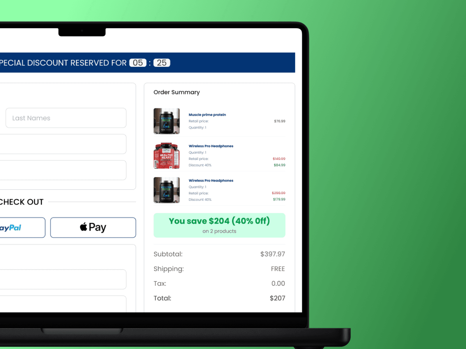
The old design treated everything as equally important. The new design guides the eye:
Product summary at the top (what you're buying, why it matters)
Payment fields in the middle (clear, minimal, no distractions)
CTA at the bottom (one button, one action, impossible to miss)
I used spacing, color, and typography to create a clear narrative: here's what you get → here's how you pay → click this to finish.
4. Optimized Copy
Rewrote all the microcopy to match the CEO's voice: warm, direct, urgency without pressure. Short sentences. Simple language. Risk-free framing near the CTA.
Small change. Big impact.
How We Tested It
We ran a full A/B test across 83,007 invoices sent between January 22 and March 10, 2026. All ACR (Abandoned Cart Recovery) offers. Old checkout vs. new checkout.
Outcome
Close rate lift: +8.3%
Old: 1.08% → New: 1.17%
Revenue per invoice sent: +29.5%
Old: $3.42 → New: $4.43 (+$1.01 per invoice)
Estimated incremental revenue during test period: ~$83.8K
Calculation: $1.01 × 83,007 invoices sent
After rolling out to 100% of offers, the numbers got even better:
Final results at full rollout:
+9.3% revenue lift
+28.7% close rate lift
+36.3% revenue per invoice sent

What This Means
Every invoice we send now generates 36% more revenue than it used to. We didn't change the product. We didn't change the pricing. We just removed the friction that was stopping customers from completing the purchase.
This wasn't a design refresh. It was a conversion optimization project with measurable business impact.
What I Learned
Every extra step costs money.
Complicated doesn't mean thorough. Simple converts. I audited every field, every decision point, every piece of copy, and cut everything that didn't directly drive the purchase.
Trust is a design problem.
Customers don't just need a payment form. They need reassurance. Security badges, risk-free messaging, and brand logos aren't decorative, they're conversion tools.
Data > opinions.
A/B testing forced us to measure what actually worked, not what we thought would work. The results justified the redesign and gave leadership confidence to roll it out company-wide.


